Netflix understands that we have a extremely short amount of time to capture a potential viewer’s interest. As such, images are the most efficient and compelling way to help users discover the perfect video as quickly as possible. After all, the human brain can process images in as little as 13 milliseconds.
In early 2014, Netflix conducted some studies that indicated thumbnails were not only the biggest influencer to an user’s decision to watch content, but it also constituted over 82% of their focus while browsing Netflix.
You have 1.8 seconds to grab an user’s attention
Thumbnails are actually Netflix’s most effective lever to influence a viewer’s choice. Netflix also saw that users spent an average of 1.8 seconds considering each title they were presented with while on Netflix.
Knowing this, Netflix has invested significantly in their thumbnails and have built a system that tests a set of images for many titles, helping display a compelling thumbnail to drive engagement. In developing this system, Netflix learned many interesting things around imagery and what actually compels an user to watch a title. Here are some of the biggest trends:
Emotion wins.
Netflix found that humans respond to faces, specifically ones expressing complex emotions which carry more information (vs benign expressions)
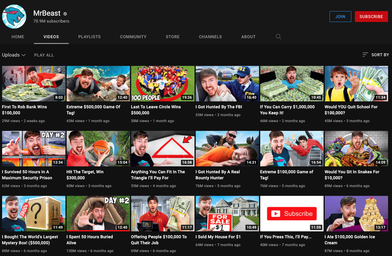
This also applies on Youtube, the thumbnail face is real and why they sometimes feel over the top. They work! Just take a look at MrBeast’s videos:
Bad guys draw more clicks
Netflix found that using visible, recognisable characters led to more engagement (particularly villains / polarising ones)
The same should apply to Youtube – Using recognisable creators/celebrities works, particularly controversial ones (and make sure you can see them!)
Less is more
Netflix found that engagement dropped when thumbnails contained > 3 people. This can feel counter-intuitive, particularly with shows that have an eclectic mix of talented lead characters. But while ensemble casts are fantastic for a huge billboard on the side of a highway, they are too complex at small sizes and ultimately, not as effective at helping our members decide if the title is right for them on smaller screens.
This learning can also be applied to Youtube. Try and reduce the number of total elements in general (vs just people). Keep them simple, and remember the thumbnails that potential viewers see are usually quite small.
Source: https://about.netflix.com/en/news/the-power-of-a-picture
Leave a Reply